Update: a followup to this post can be found here.
Shiny has been on my list of things to try out for quite some time. With it you can make interactive web applications directly in R. Earlier this week I attended a Shiny webinar for Software Carpentry instructors led by Garrett Grolemund of RStudio. Garrett made it seem so easy that the next day I sat down and wrote my first Shiny app, an interactive visualization of my car’s gas mileage.
My app is available here. If the link doesn’t work, keep reading to the bottom of the post.
This project actually began several months ago when I noticed that my car seemed to be getting worse gas mileage than I remembered it getting in the past. When I bought the car (an ‘05 Accord) a few years ago I calculated the gas mileage a couple times, but I didn’t save the numbers so I couldn’t be sure if it had changed. Now I’ve started keeping detailed data in a Google spreadsheet that I add to each time I fill up my tank. I record the date; how many miles I drove on that tank and whether they were city, highway, or a mix; gallons of gas it takes to fill up my tank; and the cost per gallon and total cost of the fill-up. Afterward I reset the tripodometer and start over.
For a while I kept an R script that downloaded the data from Google Docs and plotted it. This was pleasing on its own, but the Shiny app is way more fun. The app uses RCurl to read the data from Google Docs and changes the plot based on which driving types (highway, city, and/or mix) a user selects.
The Good
Writing the Shiny app was incredibly easy, and so was deploying it on
shinyapps.io. This post isn’t a how-to, so I won’t
go through all of the steps of writing the app, but the basic gist is this: my
app consists of a ui.R file, which displays the page and allows users to make
selections, and a server.R file, which grabs the data from Google, cleans it
up a little, and creates a few plots and a table that are displayed by
ui.R. The most recent version of the code can be found in my
GitHub repository, but here’s how the
files look as of this writing:
ui.R
library("shiny")

shinyUI(pageWithSidebar(

  ## Application title
  headerPanel("Gas Mileage"),

  ## Choose driving type(s)
  sidebarPanel(
    checkboxGroupInput("drivetype", label = h3("Driving type"),
                       choices = list("City" = "City",
                                      "Highway" = "Highway",
                                      "Mix" = "Mix"))
  ),

  ## Show plot and table summarizing gas mileage
  mainPanel(
    tabsetPanel(type = "tabs",
      tabPanel("Plot", plotOutput("mpgplot")),
      tabPanel("Summary", tableOutput("mpgsummary")),
      tabPanel("MPG over time", plotOutput("mpgtime"))
    )
  )
))
server.R
library("shiny")
library("RCurl")
library("dplyr")
library("ggplot2")
library("wesanderson")
shinyServer(function(input, output) {
## Download data
full_dat <- getURL("https://docs.google.com/spreadsheets/d/1WH65aJjlmhOWYMFkhDuKPcRa5mloOtsTCKxrF7erHgI/export?gid=0&format=csv") %>%
textConnection() %>%
read.csv(header = TRUE) %>%
filter(remove != "y") %>% # remove problematic data
mutate(date = as.Date(date, "%m/%d/%Y"),
mpg = miles / gallons)
## Reactive data for plot
dat_reac <- reactive({
filter(full_dat, driving_type %in% input$drivetype)
})
## Plot
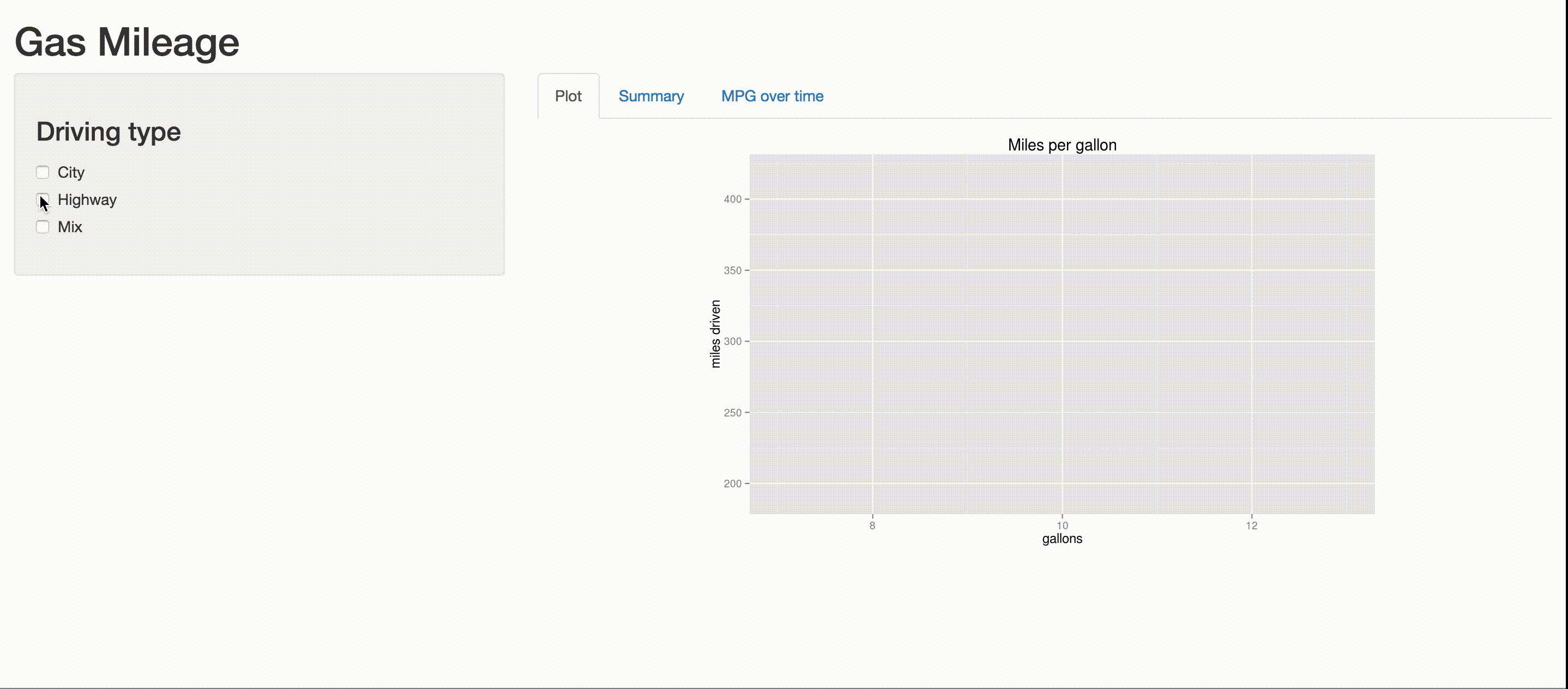
output$mpgplot <- renderPlot({
ggplot(dat_reac(), aes(x = gallons, y = miles, color = driving_type)) +
geom_point(size = 5) +
scale_color_manual(values = wes_palette("Darjeeling", 3),
guide_legend(title = "Driving type")) +
ggtitle("Miles per gallon") +
ylab("miles driven") +
ylim(190, 420) +
xlim(7, 13) +
coord_fixed(ratio = 0.015)
})
## Summary of gas mileage by driving type
output$mpgsummary <- renderTable({
full_dat %>%
group_by(driving_type) %>%
summarize(mean_mpg = mean(miles / gallons)) %>%
arrange(desc(mean_mpg))
})
## Gas mileage over time
output$mpgtime <- renderPlot({
ggplot(dat_reac(), aes(x = date, y = mpg, color = driving_type)) +
geom_point(size = 5) +
scale_color_manual(values = wes_palette("Darjeeling", 3),
guide_legend(title = "Driving type")) +
ggtitle("Gas mileage over time") +
ylab("miles per gallon") +
ylim(0, 40)
})
})The Not-So-Good
Shinyapps.io’s free account lets you deploy up to 5 apps and gives you 25 “active hours”, or hours your apps are not idle, per month. They describe this as “Perfect for teachers and students or those who want a place to learn and play” – exactly what I needed. I deployed my app at around 9:30 PM Pacific, and by the next morning I had used up 10 of my 25 hours for the month. Even with a few of my Twitter followers checking out my app, I’m not sure how I managed to use up that many hours so quickly. Clearly 25 hours is not nearly enough, even for one single, simple little personal project. Paid plans will be available soon, but the cheapest one costs $440/year (!) and only gives 250 active hours per month for all of your apps. If you try to view my app on shinyapps.io and it doesn’t work, it’s probably because I’ve run out of active hours. I’m looking into deploying this and future apps on Heroku or AWS, but I have no experience with either of these.
Still to do
I’m pleased with this app, but there are a couple things that I still want to do (in addition to making sure it is reliably available), such as: